
So, you’re diving headfirst into the exciting world of app design UI? Well, buckle up, because we’re about to take a ride on the mobile-first express! 🚀
Picture this: You’re walking down the street, and you notice someone engrossed in their phone, swiping, tapping, and scrolling like there’s no tomorrow. That’s the reality we live in! People are glued to their mobile App Design UI, and as an app designer, you need to meet them where they are.
The mobile App Design UI-first approach is all about prioritizing the mobile experience when designing your App Design UI. Why? Because your users are more likely to stumble upon your app on their smartphones than on a desktop computer. It’s all about convenience, folks!
When you start with mobile, you’re forced to focus on what truly matters in your App Design UI.
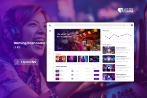
Give us a go while helping you out in App UI Design. Click here to explore App UI Design by Love you Figma.
Designing for the Small Screen App Design UI

Now, you might be wondering, “How do I even begin to App Design UI for those tiny screens?” Fear not, my fellow UI enthusiast! Embrace the challenge, and you’ll come out as a design ninja.
The first step in this journey is to understand the limitations and possibilities of mobile App Design UI. It’s like being a chef and knowing your ingredients inside out. Know your screen sizes, resolutions, and the quirks of different devices. This knowledge will be your secret sauce.
Next up, keep it simple, smarty pants! In the world of app design UI, less is often more. Opt for clean, uncluttered layouts. Think of it as the Marie Kondo method for your app: if it doesn’t spark joy (or serve a purpose), it’s outta there!
Remember, mobile users have fingers, not tiny precision styluses. So, make sure buttons and icons are large enough to tap without frustration. Nobody wants to play a game of “pin the tail on the icon” with your app.
The Thumb-Friendly Design Dance | Explore Thumb-Friendly Design By Love You Figma

Let’s talk about thumbs, shall we? Those two little digits do most of the heavy lifting in the mobile world. So, it’s your job to make their job a breeze.
When designing for mobile, consider the “thumb zone.” That’s the comfortable area where users can easily reach with their thumbs. The top corners and the center of the screen are prime real estate. Reserve those spots for the most important actions, like “Buy Now” or “Order Pizza.”
Also, embrace the magic of gestures. Swipe left, swipe right, pinch to zoom – these intuitive gestures can enhance your app’s user experience. Think of it as adding a dash of spice to your design stew. Just don’t overdo it; nobody likes a spicy stew overload!
And here’s a pro tip: Use Figma’s prototyping features to test your thumb-friendly design. It’s like having a mini thumb puppet show right on your screen!
The Mobile-First Mindset
Ah, the mobile-first mindset – it’s not just about pixels and grids; it’s a way of life. When you adopt this mindset, every design decision revolves around the mobile experience.
Think about navigation. Mobile screens can’t fit a gazillion menu options, so prioritize the essentials. Consider using collapsible menus or tab bars to keep things neat and accessible. Remember, simplicity reigns supreme.
Responsive design is your trusty sidekick here. With Figma’s responsive design features, you can create designs that adapt seamlessly to different screen sizes. It’s like having a chameleon app – it blends in everywhere!
In conclusion, my app design UI comrades, going mobile-first is like starting your journey with a sprint, not a stroll. It’s about adapting to the modern user’s habits, designing with thumb-tastic ease, and embracing the mobile-first mindset. So, grab your Figma toolbelt and get ready to craft app designs that’ll make users tap, swipe, and smile! 📱✨
“A Fresh Coat of Paint: The Ever-Evolving Mobile App Design UI Trends”
Hey there, app design enthusiasts! 📱✨ Let’s take a joyride through the ever-changing world of mobile UI trends. It’s like fashion week for your app – always something new and exciting on the runway!
Remember when skeuomorphism was all the rage? Those lifelike textures and drop shadows made us feel like we were navigating a digital scrapbook. Well, fast forward to today, and we’ve got a whole new palette of trends to play with.
“Flat Design: The Reigning Champion of Minimalism App Design UI”
First stop on our trend tour: Flat Design! 🎉 It’s all about simplicity and clean lines. Think of it as the Marie Kondo of UI design – it sparks joy by decluttering your app interface.
With flat design, you ditch the fancy gradients and shadows, opting for bold, vibrant colors and crisp typography. It’s like the app version of a crisp white shirt – timeless and universally stylish.
But wait, there’s more! Flat design has a younger sibling – Material Design. Google introduced this trend, and it’s all about creating a sense of depth through subtle shadows and animations. Imagine your app as a 3D pop-up book, and you’re on the right track.
“Neumorphism: When Skeuomorphism Meets the 21st Century”
Now, let’s talk about a design trend that’s been turning heads – Neumorphism. It’s like the cool, mysterious cousin of skeuomorphism.
Learn more about Neumorphism vs Skeuomorphism.
With Neumorphism, you get the best of both worlds – a touch of skeuomorphic realism blended with modern minimalism. Elements appear to be slightly raised from the background, creating a soft, tactile feel. It’s like your app’s inviting users to touch the screen!
Imagine your buttons and icons having this subtle, almost magical quality, like they’re floating above the surface. Neumorphism adds a layer of elegance to your app, making it look sleek and futuristic.
“Dark Mode: Saving Battery and Eyes, One Pixel at a Time”
Now, let’s dim the lights and talk about Dark Mode – the trend that’s easier on your eyes and your device’s battery. It’s like a night owl’s dream come true!
Dark Mode flips the script by using dark backgrounds with light text and elements. It’s not just about aesthetics; it’s about functionality. It reduces eye strain in low-light conditions and conserves battery power on OLED screens.
But here’s the cool part: Dark Mode isn’t just about going dark; it’s about choice. Many apps now offer a toggle so users can switch between light and dark modes. It’s like having both a day outfit and a night outfit for your app.
“Embracing Microinteractions for App Design UI: Tiny Moments, Big Impact”
Our next stop on the trend train is all about those little moments that make a big difference – Microinteractions! They’re like the sprinkles on top of your app’s design cupcake.
Microinteractions are those tiny animations or feedback loops that respond to user actions. Think of a heart animation when you ‘like’ something or a subtle bounce when you pull to refresh. These little details add personality to your app and create a delightful user experience.
And guess what? Figma makes creating these microinteractions a breeze. With its prototyping features, you can breathe life into your designs, making users smile with every tap and swipe.
Buy Mobile App Design UI in just $0.5 Click here to buy.
“Bold Typography: Making a Statement with Words”
Last but not least, let’s talk about bold typography – the trend that says, “Look at me!” Typography isn’t just about fonts; it’s about making a statement.
With bold typography, you can use big, expressive fonts to convey your app’s personality and message. It’s like dressing your app in a stylish, attention-grabbing outfit.
But remember, with great fonts come great responsibilities. Choose fonts that align with your app’s identity and ensure they’re legible. You don’t want users squinting at their screens like it’s an eye test.
In conclusion, the world of mobile UI trends is a vibrant, ever-changing playground. From flat design to Neumorphism, Dark Mode to microinteractions, and bold typography, there’s a trend for every taste.
So, embrace these trends like a fashion-forward designer, experiment, and find the ones that resonate with your app’s personality. With Figma by your side, you’re ready to create designs that not only look modern but also deliver a delightful user experience. Happy designing, trendsetters! 🎨📱✨
“The Marvelous Magic of Responsive App Design UI”
Hey there, fellow app design aficionados! 📱✨ Today, we’re diving headfirst into the enchanting world of responsive UI design with our trusty sidekick, Figma! Buckle up; it’s going to be a wild ride through the pixelated wilderness.
So, what’s all the buzz about responsive design? Well, it’s like having a wardrobe that magically adjusts to fit you perfectly, no matter your size or shape. In the world of app design UI, it’s about creating interfaces that look fantastic on any device, from the tiniest smartphones to the grandest desktop screens.
Buy Responsive Mobile App Design UI in just $0.5 Click here to buy.
“The Art of Flexibility: Responsive Grids and Layouts”

Picture this: Your app design is a flexible acrobat, effortlessly performing stunning moves on various devices. That’s what responsive grids and layouts are all about! 🤸
Figma, our trusty design pal, offers a range of tools to help you create responsive grids that adapt like chameleons. You can set up grids to automatically adjust column widths and spacing, ensuring your app looks spiffy on every screen.
But it’s not just about grids; it’s also about embracing flexible layouts. Think of it like a puzzle – you arrange elements in a way that they fit snugly on small screens but also sprawl comfortably on larger ones. Figma’s layout grids and constraints are your secret weapons in this design adventure.
“Media Queries: The Sherlock Holmes of Responsive Design”
Now, let’s put on our detective hats and talk about media queries – the Sherlock Holmes of responsive design. 🕵️♂️
Media queries allow you to investigate the device’s characteristics and apply specific styles accordingly. For example, you can create different styles for smartphones, tablets, and desktops, making your app look tailor-made for each.
Figma makes it a breeze to experiment with media queries. You can preview your design in various device sizes and see how it adapts in real-time. It’s like having a crystal ball to predict how your app will look on different screens.
“Icons and Images: Scaling Gracefully Across Devices”
Let’s not forget about icons and images – the superstars of your app’s visual storytelling. In the responsive design universe, they need to be shape-shifters.
With Figma, you can create vector icons that scale beautifully, maintaining crispness no matter the screen size. Say goodbye to pixelated nightmares! You can also set different image resolutions for various devices, ensuring speedy loading times without compromising quality.
Remember, responsive design isn’t just about resizing; it’s about optimizing the user experience. So, think strategically about what content and features are most crucial for each device type, and make them shine.
“Testing, Testing, 1-2-3: The Importance of User Testing”

Now, my dear app design adventurers, before you embark on your responsive UI journey, don’t forget to pack your user testing compass! 🧭
Responsive design is a bit like creating a Swiss army knife – it’s incredibly versatile, but you need to ensure all its tools work seamlessly. That’s where user testing comes in.
Gather a diverse group of users, hand them different devices, and watch how they interact with your app. Do they find everything easily? Is the experience smooth and enjoyable? Take notes and make improvements accordingly.
Figma can assist with user testing too. You can create interactive prototypes and gather feedback from users, making it a collaborative adventure. And remember, responsive design is a continuous journey; keep refining and optimizing as technology evolves.
“In Conclusion: Crafting a Responsive Masterpiece with Figma”
As we wrap up our responsive design expedition, remember that Figma is your trusty companion in this ever-changing landscape. With its flexible grids, media queries, and responsive design features, you can create an app UI that adapts gracefully to any device.
Responsive design isn’t just about fitting your app onto different screens; it’s about providing users with a consistent and delightful experience, no matter how they choose to access your creation.
So, go forth, fellow designers, and let responsive design be your artistic canvas. With Figma in your toolkit, you’re well-equipped to craft a responsive masterpiece that leaves users in awe. Happy designing, and may your pixels always be responsive! 🎨📱✨
Let us handle your burden! Give Love you figma a try to start your Mobile App design UI. Click here to explore.